

When I started working on web design projects in Barcelona, many clients asked me if it was worth incorporating Dark Mode into their pages. At first, some saw it only as an aesthetic trend, but over time I have found that this option goes far beyond visual design. In fact, it can make a major difference in the user experience, accessibility, and even energy efficiency of devices.
In this article I will share the main benefits of dark mode and also some good practices that I have been applying in different projects.
What is Dark Mode and why is it so popular?
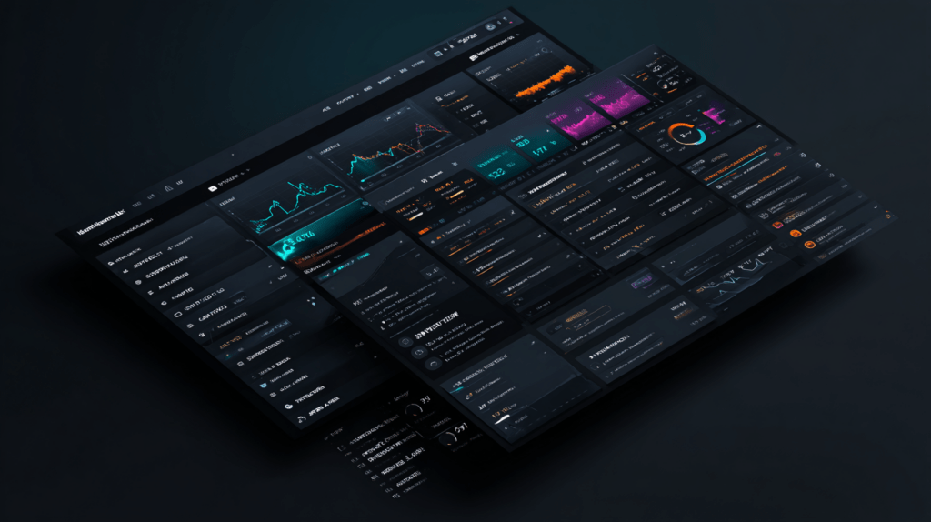
From the outset, it should be made clear that Dark Mode is all about reversing the usual color scheme. Instead of white backgrounds with dark text, we find dark backgrounds with light fonts. Although it seems simple, its correct implementation requires careful design decisions.
What has surprised me over the years is to see how its popularity has grown. Many users claim that they prefer to use applications, social networks or websites with this mode activated, especially at night. In addition, large platforms such as Google, YouTube or Instagram already offer this option, which has consolidated the habit in millions of people.
Benefits of Dark Mode
1. Reduced eye strain
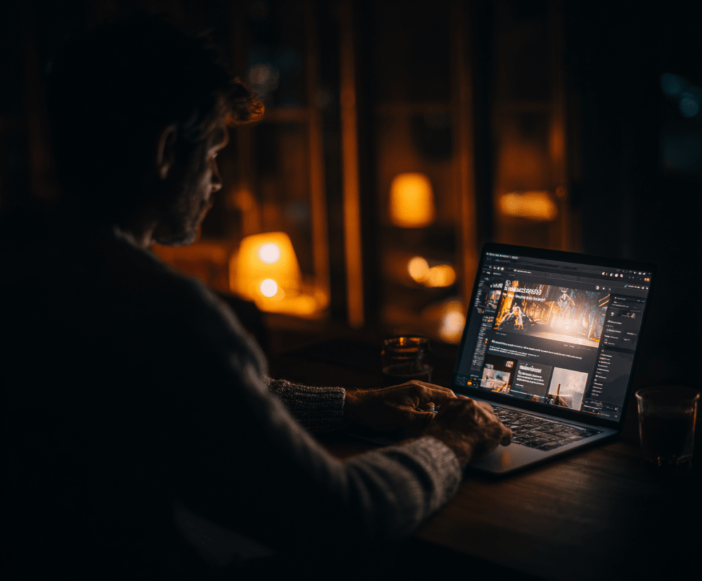
First of all, Dark Mode can help reduce eye strain in low-light environments. When we are looking at a screen with a white background in the dark, the light impact is much more intense and can lead to fatigue. In contrast, with a dark interface, the transition between the environment and the screen is smoother.
2. Battery Saver
Secondly, energy efficiency should be highlighted. On devices with OLED or AMOLED screens, the black pixels remain off and this reduces consumption. This translates into more hours of use without the need to charge. For this reason, when I propose web design strategies in Barcelona, I always remember that this detail can be key for the user who browses from the mobile.
3. Accessibility and inclusion
It’s also important to talk about accessibility. People with eye sensitivity or specific visual conditions may find Dark Mode much more comfortable. Still, I’ve found that it’s not universal: there are users who still prefer Dark Mode. Therefore, the best solution is always to offer the option to choose.
4. Modern aesthetics and differentiation
Finally, there is a benefit that cannot be ignored: the visual impact. Dark Mode conveys modernity and can help a brand differentiate itself. When I present a web design project in Barcelona, I often recommend using it as an aesthetic complement, always maintaining consistency with the company’s visual identity.
Best practices for implementing Dark Mode
Implementing Dark Mode is not just about inverting colors. There are several key points to keep in mind:
Choosing the right contrast
Contrast is essential. A pure white on an absolute black can be too aggressive for the eye. In my experience, dark grays work best as a background, combined with soft light tones in the text.
Review the color palette
Not all colors behave the same on dark backgrounds. For example, a deep blue can lose legibility, and a red one can be too strident. You need to adapt the color palette and make sure that the interactive elements remain easy to distinguish.
Prioritize the visual hierarchy
The hierarchy of elements should be kept clear. This involves adjusting shadows, highlights, and typographic weights so that buttons, links, and notices stand out without losing harmony with the whole.
Allow customization
Dark Mode should always be optional. Some people want it all day; others only at night; and there are those who never use it. Therefore, a good practice is to offer a visible switch and, if possible, an automatic adjustment linked to the operating system or time of day.
Testing with real users
Finally, nothing replaces testing with users. This is how unexpected problems can be detected, such as insufficient contrast or typography that looks too thin on dark backgrounds.
When does it make sense to use Dark Mode?
Although many customers think that Dark Mode is always positive, I think it should be assessed on a case-by-case basis. For example, in reading applications or professional tools for night-time use, it is almost essential. On the other hand, on very visual websites, with clear images and bright colors, it may not fit so well.
In any case, when planning a web design project in Barcelona, I think it is an option that should not be ruled out from the start. It provides flexibility and shows special attention to the needs of users.
Conclusion
Dark Mode has ceased to be a simple fad to become a standard that many users hope to find. The benefits are clear: it reduces eye strain, saves battery, improves accessibility and brings a contemporary aesthetic. However, its implementation must be responsible and consistent, with real tests and good management of contrasts and palettes.
From my experience, I recommend that each project assess whether this option fits with the objectives and brand identity. In short, Dark Mode can be a powerful tool if applied judiciously.
If you want your digital project to be competitive and take into account these UX and accessibility details, at wwwarcelona.com we offer design and development services specialized in web design in Barcelona, adapted to new trends and designed to maximize the experience of your users.
FAQs
-
Is Dark Mode recommended on all websites?
Not necessarily. In visual projects with many photographs or clear graphics, it may not be the ideal option. Even so, in web design in Barcelona it is common to offer it as an option to give flexibility to users.
-
What mistakes should be avoided in a design in Dark Mode?
One of the most common mistakes is to use contrasts that are too strong or colors that lose visibility on dark backgrounds. You should also avoid imposing it without giving the option to change.
-
Does Dark Mode always improve the user experience?
Not always. It depends on the context and type of content. Therefore, the best practice is to allow the user to choose between light and dark mode.
-
What are the main benefits of Dark Mode?
Dark Mode reduces eye strain in dark environments, saves battery life on OLED devices, and improves accessibility for light-sensitive users.
